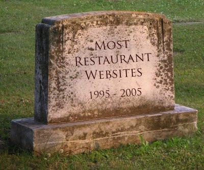
Top 10 Ways To Ruin Your Restaurant Website
Here are the problems. (1) What looks good in a restaurant doesn't always look good on the web. (2) You need to consider more than just "design" on the website (sure, your personal taste in design is crazy and frightening but your food is amazing... unfortunately, no one has yet invented a way to taste food over the internet and people who are terrified -or worse, bored- by your website might never find themselves making their way into your doors to taste that amazing food). (3) The purpose of a restaurant website is primarily...
The Top 10 Things You Should Never Do To Your Restaurant/Cafe Website
It's tempting. You are a successful chef and business-person who rules your restaurant with a tight (yet understanding) grip. Whatever you says goes and you have a very specific idea of how things should look. You designed the layout of your cafe and people love it. You decided what colors to paint the walls and whether or not your ceiling would be tiles or would display the industrial-modern look. You decided that a website would be good for business and, by george, you will have the last say in its design (and it will most likely look exactly like the inside of your establishment). Here are the problems. (1) What looks good in a restaurant doesn't always look good on the web. (2) You need to consider more than just "design" on the website (sure, your personal taste in design is crazy and frightening but your food is amazing... unfortunately, no one has yet invented a way to taste food over the internet and people who are terrified -or worse, bored- by your website might never find themselves making their way into your doors to taste that amazing food). (3) The purpose of a restaurant website is primarily for attracting and/or educating new patrons, but they are generally designed only for those who are already customers.
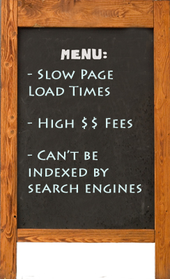
My goal in writing this post is to give you a list of things that you should avoid in designing your restaurant website, and to give you suggestions for what will help attract potential customers to your physical location through your website. In lieu of this, here are the Top 10 worst things you can do to your restaurant website (in order of my opinion of their importance) as well as some suggestions for how you can change (or avoid these mistakes!):
#1 - Use Flash As Your Main Design Component
So much has been written on this that I am not going to spend an inordinate amount of time on it. Just be aware of the fact that Flash can slow down the page load time for your impatient potential customers, search engines are not able to access the information on your pages so they can rank you higher when potential customers search for certain keywords, Apple mobile devices do not support the use of Flash, and frankly, the shiny/flashy experience is so early 2000's. Of course, keep in mind that if you make sure to not use Flash as your main design component and instead use it to supplement the user experience, you may actually be able to incorporate it well into your site design. For example, Papa Johns (and other pizza websites) use Flash as an interactive build-your-own-pizza user experience. Feel free to add things like this to your website, just understand that you also need to ensure that you are getting text for search engines to index on those pages and be aware that adding Flash tends to raise the cost of building your website and increase page load times.
As a side note (this one's for free), please also get rid of the initial introduction page (Flash or no) with the random picture/movie and the "Enter Website" link. I think this probably had to do with the days of Flash and a desire to have both a rich initial user experience and a more "meat and potatoes" site once the link was clicked... but it only results in putting one more step in between a very busy potential customer and your website.
Suggestion: Redesign (or tell your web designer to design) your website implementing CSS and HTML without Flash (or with limited usage that is only for enhancing User Experience) to give your customers a unique and simple design which will be easier to navigate, more modern, and will be accessible by search engines to index (i.e., so you can be found easier when people search for terms related to your specific restaurant!). More suggestions on site design will be given on #2.
#2 - Have a Crazy Theme Design
Unique is good. Stylish is good. Eclectic is good. Simple is good. "I want to tear my eyeballs out when I look at your site" is bad. A website that incorporates basic design fundamentals with a few personal touches can look great and be easy to use. Unfortunately, restaurant websites are well known for having multiple colors clashing and crazy artwork that does nothing to serve the website visitor.
Suggestion: Redesign (or tell your web designer to redesign) your website implementing CSS and HTML to give your customers a unique and simple design which will be easier to navigate, more modern, and will be accessible by search engines to index (i.e., so you can be found easier when people search for terms related to your specific restaurant!). As you are designing your website, think creatively, but also think about the fact that simple is better on the web. Ironically, it is often cheaper to go simpler (but still professional looking) rather then to use Flash and an extravagant theme design. Since it is difficult to state exactly what I mean, I will just list a few restaurant websites that I think are well-designed and simplistic yet still maintain their individuality.
- FIG - A simple design that contains a modern feel. Notice the obvious and uncluttered menu bar at the top and the eye-catching images giving the viewer an idea of what to expect when visiting.
- Ruby Tuesday - A design that immediately catches the eye with the large rotating images. At the time of writing this, there is a very large "it's football season" banner thus accenting the fact that they most likely have a sports-bar-like atmosphere.
- le 28 Thiers - This design made me literally say "wow". For being a French restaurant and website, it has a surprisingly... well, French feel to it. It just feels stylish, warm, elegant, and professional.
- The Little Cake Parlour - Somehow, the designers of The Little Cake Parlour design their website to reflect a cake, and they do it extremely well. It somehow has a contemporary and classic feel at the same time that really draws the visitor in.
- The Noodle Box - The large image with the "South-East Asian noodle bar" text leave no doubt in any visitor's mind as to where they have arrived at. Predominately dark colors can often be a negative for websites, but The Noodle Box really uses the dark colors well. A great looking navigational menu also adds to this excellent restaurant design.
- McDonalds - I hate to say it, but McDonalds really does have a great website (their use of Flash almost gets on the excessive side, but it is also interactive and doesn't really slow down page load time - so I'll leave them alone about that). It defines the term "simple web design". Let's be honest, red and yellow together can be pretty awful web design colors, yet Mickey D's pulls the combination off. A simple large picture of the most recent promotion completes the fairly empty main page. Take this with a grain of salt though, since a billion or so people have actually been to a location, McDonalds doesn't need to market themselves as much as a mom and pop startup, but there is still something to be learned by a multi-billion dollar corporation opting for such a simple web design.
#3 - Have a Complicated and Enigmatic Navigational Menu (not the food menu, that's #4)
By "menu" I am not referring to the one that tells your customers which food you offer, but the way they can navigate around your site (you know, the buttons that say "About Us", "Get Directions", etc). I was going to put this lower on the list until I thought about it some more. If you have an attractive website design that is optimized for Search Rankings, but where no one can find anything because they can't figure out where to begin looking, then you need to rethink your menu strategy. It is essential for a good user experience, that you have a well-thought out and easily navigable menu. This means removing pages and options that are unimportant, and consolidating everything into the most sensible arrangement possible. Ask yourself, what does my customer want to find and what is the easiest way for him/her to get that information?
Suggestion: It may be useful to do a customer survey of your actual customers to discover why they would visit your website. However, some of the key reasons people visit a restaurant website is to find out information about it, to find directions/contact info, to find a food menu, to get an idea of the experience and if it would suit their individual needs. If your menu structure has a mountain of information aside from these key categories, you may need to consider restructuring it. Also, navigational menu location is important. People generally read a website from the top left and over, therefore, the most obvious place for a menu is a bar across the top with the most important categories reading from left to right (which is how English is read, interestingly enough). Obviously you want to be creative and work with your own design... but never sacrifice the user experience for your own opinion of what your site should look like. When in doubt, ask 10 random people to find something and if it takes the majority of them longer than a couple of seconds or one click, then you probably need to rethink your menu strategy.
For more ideas on creative website menu ideas (both good and bad), check out this post: Showcase of Creative Navigation Menus.
#4 - Don't Have An Easily Accessible Food Menu
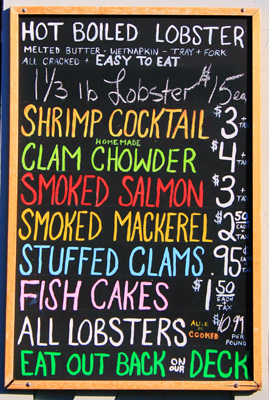
One of the few reasons a visitor (whether new or returning) will come to your site is in order to find out what you offer. Having a good menu that describes your food/drinks can be the difference between attracting a customer and losing them to your competition. Oh, and please, please, please do not force your visitors to download your menu in order for them to see it. A PDF download can be nice for some who want to print it (though I'm not sure that number is too much higher above 0 than you think), but for the rest of us, have an easy to find menu on your site with a downloadable/printable option in case someone does want to print it.
Suggestion: Incorporate a descriptive menu of your food and drink offerings into your website design. If you do this already, think of ways you can improve it. I recommend that you spend a little extra time to describe your dishes on the website. Nothing entices me more than to find a restaurant that describes its food on its menu in such a way that I have to try it out! Also, there are different reasons for not including prices and it is your decision at the end of the day, but may I suggest that you include prices in your menu. When I personally am looking for a place to eat, I will not visit a place where I do not know the price range. I would rather miss out on a must-go place, than to arrive there and discover I am not able to afford it... after I've arrived or worse, after I've sat down (if memory serves me, I've only had to walk out of a restaurant once because of the price and it was highly embarrassing).
#5 - Auto-play Your Music Or Video
I don't think I can say it much better than this guy: 10 Reasons Websites Should Not Play Music. For videos, just go through his post and replace the word "music" with the word "video" and you'll get the idea. Auto-play anything slows down your page load time and often throws something at a visitor that most would really rather not hear or see at the exact moment they land on a website.
Suggestion: Frankly, I really don't think you should ever have music on your restaurant website and I think the case is strong against having it. As for videos, insert them in an obvious place on your page. If the user wants to see it, then they can decide to play it.
.
#6 - Be An Enigma
Who are you as a restaurant? What do you offer? Where are you? Who comes to your restaurant? Who do you cater to? What makes you unique? It's hard to really get excited about something you know nothing about. Sure, there can be some marketing and peer hype that gains initial interest, but I truly believe that successful long-term online interaction with your customers must include an open and honest picture of who you are. Remember to follow the 3-5 second rule - that is that you have your visitor's interest for 3-5 seconds when they initially come to your website. Immediately present them with a clear picture of who you are or you risk losing them.
Suggestion: A place to start in detailing who you are to your customers (and erasing the enigmatic image) is here:
- Determine what is important for your visitor to know about you and display that clearly on your home/main page.
- Make Contact Information readily available - A separate page for contact info is good, a separate page PLUS your contact information in the footer of every page is great! (For example, see FIG's website again).
- Make Your Location/Directions/Hours readily available - May I suggest a well designed page with embedded map/directions that includes a couple of pictures of the exterior and interior of the building (to give your customers help in finding the place once they get there, and to help them know what to expect in style and decor).
- Design an attractive "About Us" Page - This is often a popular page on websites. People like to know who they are buying from, reading, or ordering from. Generally, the personal touch goes over well since customers tend to get more excited about people they "know". Consider a short bio of your management/waitstaff/bartenders/whatever. Get creative!
- Design an attractive "What to Expect" Page - I have never seen this idea on a restaurant website, but it stems from the popularity of restaurant review sites like Yelp. People like to visit these for the reviews, but they also like to see all of the information firsthand so they know what to expect. Is there a parking lot or street parking? Is there a dress code? Recommended dress? Live music? Average price of entrees? I've always wanted to see a restaurant website with a page devoted entirely to prepping the customer for their visit. Maybe it would be best as a combined "About Us" and "Contact Us" page? The sky's the limit, get creative and don't be an enigma to your customers.

#7 - Ignore Customer Reviews, Ratings, & Press
Reviews and ratings are becoming more and more of a factor in customer choices for restaurants. As I stated elsewhere, the first thing to do is to ensure that you are on some of these review sites. Also, ensure that you are taking advantage of anytime anyone has positively reviewed, commented, or blogged about your site.
Suggestion: Consider adding links to blogs, review sites, or other areas where your restaurant has been positively reviewed. If you really want to collect reviews, ask some of your most loyal customers to write up reviews for you to post that can scroll through your "About Us" Page. People feel more confident about testing the waters when they see that others are already swimming.

#8 - Keep Your Information & Specials Out Of Date
"We saw on your website that the Smoked Salmon is a special this week."
"I'm sorry, ma'am, that was our 2007 special."
Sound familiar? Having great and creative content is important, but it gets quickly frustrating if that content is out of date. If we can't trust you to keep your website up-to-date, why would we trust you with our lives in eating your food?
Suggestion: Assign someone (who actually does have the time), to keep the website up-to-date. Specials and staff bios are great, but only if they are applicable, today.
#9 - Ignore Your Mobile Customers
There are now 82.2 million smartphone users in the USA, which has gone up 10% in the last three months (source here). While it is not always advisable to design a completely different website for your mobile customers, do not forget about them! Make sure that your website design and navigation is mobile friendly and gain those customers who are looking for a new place to try after they've already left their home computer.
Suggestion: Test your website design with a variety of mobile devices and platforms. Make design & navigation changes that will benefit both computer and mobile users. Research cost and effort for developing a mobile site. If you use an Analytics tool (of which you absolutely should!), determine how many of your site visitors are mobile (in Google Analytics, this information can be found in the "Visitors" tab). If it is a high percentage, it may be worth developing a mobile site to offer those visitors.
#10 - Don't Offer Online Reservations
I admit, there are different reasons for offering or not offering reservations at your establishment. However, if you decide to allow reservations, I think an online reservations system is essential. With the onset of smartphones, more web surfing and less phone conversations are happening, which I think reflects on the fact that online reservations will continue to grow in popularity.
Suggestion: Look into incorporating an online reservation system into your website, or at the very least using a tool like Open Table to help you on this front.
You have great food, a unique personal taste in design, and a love for serving your customers. Use your website to display that to potential customers - not hide it underneath a mountain of Flash, auto-playing music/videos, and menus they can never find or easily access. What about you? Any of these you have observed? Any you disagree with? Any other restaurant website faux pas' that I left out? I would love to hear your input!
Bonus Point
So I must sheepishly admit that David of Hospitality Formula kindly pointed out a fairly significant mistake restaurants can often make on their websites that I left out. While not every idea deserves to be in the Top 10 (or at least the top 11), I must admit that this idea is important enough to deserve a position in the blog post and not just in the comments:
Bonus Mistake #11 - Don't Connect With Your Customers Outside Of Their Physical Presence In Your Restaurant
Social Media channels (specifically Twitter, Facebook, and Google+) have exploded in popularity and it is essential that you as a restaurant do not ignore their importance. Use these as marketing platforms yes, but only in the sense that you are also engaging your customers at a real level. Leverage the chance to be a real voice of discussion and interaction with your customers (and not just a shouting bullhorn of marketing for them to ignore).
Suggestion: Again, I want to give full credit to David for his comment and suggestions regarding this point: Get a Facebook Page for your restaurant and begin regularly and creatively posting on it. Get a twitter account, and then read this post regarding the best way to use twitter as a restaurant: How Are You Using Twitter?. Make sure to also incorporate the social media buttons on every page (or at the very least the About Us/Contact Us pages) on your website. Consider holding contests with gift certificates for a certain number of followers/fans/etc. Also, consider adding a method of collecting email addresses so you can send out live music info, new menus, or whatever else you would want to send. Whatever you do, get creative on interacting with and building relationships with your customers outside of their physical presence in your store.
Like this post? Help us spread the word by sharing it on twitter, facebook, linkedin, or google plus! You can do this at anytime by using the social box on the left side of your screen.
